- Published on
Mapping the Distribution of Religious Beliefs in Singapore
- Authors
- Name
Inspired by my thesis, I have been playing around with mapping tools over the past few days. While the maps showing the distribution of migrant groups across the United States did not make it to the final copy of my paper I had fun toying around with the various mapping packages. In this post, I decided to apply what I have learnt and take a look at the spatial distribution of Singapore's population. This is also slightly related to another idea that I have been pondering on for a while - finding an equivalent of U.S. counties to run a fixed effect model.
Data sources
Shape files for Singapore can be found on data.gov.sg portal. The most recent map polygon can be downloaded from https://data.gov.sg/dataset/national-map-polygon. 1 A secondary mapping source subdividing Singapore into 55 regions is released under the URA 2014 Master Plan: https://data.gov.sg/dataset/master-plan-2014-planning-area-boundary-web.
Next, we need some data by geographical distribution. There are a variety of aggregate survey data from the 2000 / 2010 Census of Population and 2015 General Household Survey (GHS) subdivided by geographical regions that one could play around with. They can be found using Singstat's Table Builder under the population, geographical distribution subfield. For this analysis, I decided to take a look at the distribution of religious beliefs and downloaded Table 141 from the 2015 GHS, "Resident Population Aged 15 Years and Over by Planning Area and Religion." A convenient feature is that the survey was conducted based on the planning areas demarcated in URA's master plan 2014 so that makes mapping the statistics to regions straightforward.2
Analysis
I will be using the following R packages: rgdal, rgeos, raster, maptools for reading in and processing shapefiles, tmap and tmaptools for graphing maps and dplyr for general data manipulation.
Reading in a shapefile can be done using the readOGR function. The file is formatted such that it contains the GIS information as well as other appended data fields. To properly align and display different shapefiles, one has to ensure that the maps are projected using a similar system (check using proj4string). The names() function reveals the data fields that are appended with the GIS information and one can further manipulate those variables using standard r commands. The most relevant variable here is the one entitled FOLDERPATH which list what category each polygon belongs to.
sg_shape <- readOGR(dsn=GIS_path, layer="SingaporeMap_Polygon", verbose=FALSE)
sg_plan <- readOGR(dsn=GIS_path, layer="MP14_PLNG_AREA_WEB_PL", verbose=FALSE)
proj4string(sg_shape)
## [1] "+proj=tmerc +lat_0=1.36666666666667 +lon_0=103.833333333333 +k=1 +x_0=28001.642 +y_0=38744.572 +datum=WGS84 +units=m +no_defs"
names(sg_shape)
## [1] "OBJECTID"   "NAME"       "FOLDERPATH" "INC_CRC"    "FMEL_UPD_D"
## [6] "X_ADDR"     "Y_ADDR"     "SHAPE_Leng" "SHAPE_Area"
unique(sg_shape$FOLDERPATH)
##  [1] "Layers/SMap_Anno1"                  "Layers/SMap_PedraBranca_Inset_Anno"
##  [3] "Layers/SMap_Anno2"                  "Layers/Hydrographic_Anno"
##  [5] "Layers/PB_draw_frame"               "Layers/Hydrographic"
##  [7] "Layers/Airport_Runway"              "Layers/Central_Business_District"
##  [9] "Layers/Parks_NaturalReserve"        "Layers/Coastal_Outline"
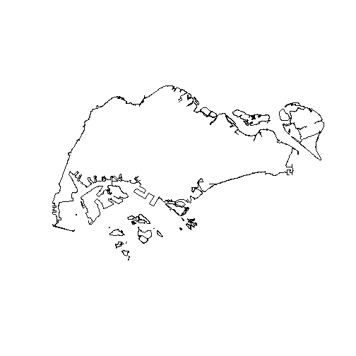
The names of the FOLDERPATH variable suggests that the dataset contains shapefiles for Singapore as well as the surrounding area. Let's restrict the plotting boundaries to mainland Singapore and exclude Pedra Branca. The base R plot function suffice for simple plotting, though for more complicated plots I prefer to use the tmap package.
exclude <- c("PEDRA BRANCA", "JOHOR")
sg_shape_main <- sg_shape[(sg_shape$FOLDERPATH %in% c("Layers/Coastal_Outline")) &     !grepl(paste(exclude,collapse="|"), sg_shape$NAME),]
sp::plot(sg_shape_main)

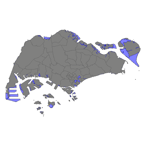
A similar set of procedures can be run on URA's planning boundaries as well. There are two main differences between the maps. First, the current national map does not contain the region boundaries. Second, URA's projected land surface differs from the actual map.
tm_shape(sg_shape_main) +
  tm_polygons(col="yellow") +
  tm_shape(sg_plan)+
  tm_polygons(col="blue", alpha=0.5) +
  tm_layout(frame=FALSE)

The main differences are the extra land reclamation at Tuas South, Pulau Tekong and the northern boundaries.3 To transfer the region boundaries to the current map, we will need to employ a few tricks. This involves intersecting each region of URA's planning boundaries with the current map before taking the union of all these regions and appending the data back to the shapefile. The buffer function is used to bypass a 'self-intersecting polygon' problem and the unionSpatialPolygons function is needed to combine small isolated polygons.^[One could also use the functions from the rgeos package such as gIntersection but the functions in raster make it slightly easier since they keep the file as a SpatialPolygonsDataFrame.]
### Combine region mapping with actual Singapore map
sg <- raster::intersect(buffer(sg_plan, dissolve=FALSE), as(sg_shape_main, 'SpatialPolygons'))
sg <- unionSpatialPolygons(sg, IDs=as.factor(sg$PLN_AREA_N))
### Append the data back
sg <- SpatialPolygonsDataFrame(sg, sg_plan@data, match.ID="PLN_AREA_N")
Next, we prepare the census data before merging it in with the shapefile. This involves reading in the 2 csv files (national and region) and standardising the region names such that they match the ones that come with the shape file. In addition, I calculate the proportion of each religion living in a particular area.
ghs2015_national_rel$Level_1 <- trimws(gsub("(- Catholic)|(- Other Christians)", "", ghs2015_national_rel$Level_1))

ghs2015_national_rel <- ghs2015_national_rel %>%
  group_by(Level_1) %>%
  mutate(Value = sum(Value),
         national_prop = Value / 3275.9 *100) %>%
  ungroup() %>%
  distinct() %>%
  rename(rel = Level_1) %>%
  dplyr::select(rel, national_prop)

ghs2015_religion$Level_3 <- toupper(trimws(ghs2015_religion$Level_3))
ghs2015_religion$Level_2 <- trimws(ghs2015_religion$Level_2)
ghs2015_religion$Level_1 <- trimws(ghs2015_religion$Level_1)
ghs2015_religion$rel <- ghs2015_religion$Level_1
ghs2015_religion$rel <- ifelse(ghs2015_religion$rel=="Christianity- Other Christians",
                               "Christianity",ghs2015_religion$rel)
ghs2015_religion$rel <- ifelse(ghs2015_religion$rel=="Christianity- Catholic",
                               "Christianity",ghs2015_religion$rel)
ghs2015_religion$Value <- as.numeric(ghs2015_religion$Value)
ghs2015_religion_total <- ghs2015_religion %>%
  filter(Level_1=="Total") %>%
  dplyr::select(Level_3, Value) %>%
  rename(Total = Value)

ghs2015_religion <- ghs2015_religion %>%
  filter(Level_1!="Total") %>%
  group_by(Level_3, rel) %>%
  mutate(num = sum(Value)) %>%
  ungroup() %>%
  left_join(ghs2015_religion_total, by="Level_3") %>%
  mutate(prop = Value/Total * 100)
Now it is time to dive into the data and uncover some interesting facts. First, let us find out the most prevalent religious beliefs in Singapore.
knitr::kable(arrange(ghs2015_national_rel, desc(national_prop)), format="html")
| rel | national_prop |
|---|---|
| Total | 100.0000000 |
| Buddhism | 33.1908788 |
| Christianity | 18.8070454 |
| No Religion | 18.4529442 |
| Islam | 14.0358375 |
| Taoism | 9.9636741 |
| Hinduism | 4.9604689 |
| Sikhism | 0.3510486 |
| Other Religions | 0.2411551 |
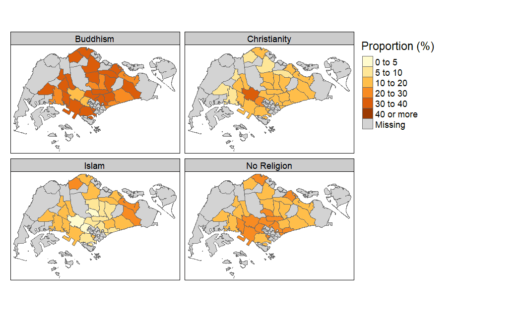
Next, we can visualise the distribution of religious beliefs. The append_data function is used to append the data to the shapefile. For the following plot, I show the distribution of the top 4 religious beliefs in Singapore.4
ghs2015_religion_prop <- ghs2015_religion %>%
                         filter(Level_1!="Christianity- Catholic") %>%
                         dplyr::select(rel, Level_3, prop) %>%
                         reshape2::dcast(Level_3 ~ rel)

sg2 <- st_as_sf(sg)
sg_religion_map <- left_join(sg2, ghs2015_religion_prop, by = c("PLN_AREA_N" = "Level_3"))

tm_shape(sg_religion_map) +
  tm_polygons(c("Buddhism","Christianity","Islam","No Religion"),
              breaks = c(0, 5, 10, 20, 30, 40, Inf), colorNA="light grey",
              title="Proportion (%)") +
  tm_facets(free.scales = FALSE) +
  tm_layout(panel.labels=c("Buddhism","Christianity","Islam","No Religion"))

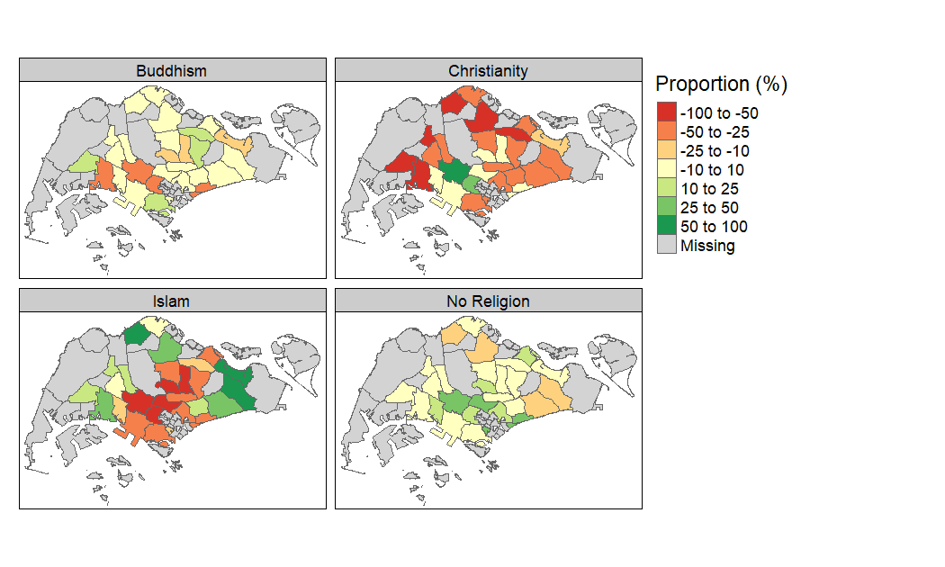
Data is available only for 27 out of the 55 regions. The excluded regions such as the Central Water Catchment or Downtown area probably contain too few residents and the data has been suppressed. Another way of visualising the distribution would be to compare it against the national average. This would give a clearer picture on which regions contain relatively more/less people of certain religious beliefs.
ghs2015_religion_nat <- ghs2015_religion %>%
  filter(Level_1!="Christianity- Catholic") %>%
  dplyr::select(rel, Level_3, prop) %>%
  left_join(ghs2015_national_rel, by="rel") %>%
  mutate(diff = prop - national_prop, relative_diff = diff/national_prop *100) %>%
  dplyr::select(Level_3, rel, relative_diff) %>%
  reshape2::dcast(Level_3 ~ rel)

sg_religion_map2 <- left_join(sg2, ghs2015_religion_nat, by = c("PLN_AREA_N" = "Level_3"))

tm_shape(sg_religion_map2) +
  tm_polygons(c("Buddhism","Christianity","Islam","No Religion"),
              breaks=c(-100,-50, -25, -10, 10, 25, 50, 100),
              colorNA="light grey",
              title="Proportion (%)") +
  tm_facets(free.scales = FALSE) +
  tm_layout(panel.labels=c("Buddhism","Christianity","Islam","No Religion"))

It appears that the distribution of people who holds Buddhist beliefs are quite evenly distributed across Singapore. By contrast, the Christian population is concentrated around Southern and Central Singapore while believers of Islam are concentrated around the peripheral regions of the island. There is also a greater fraction of people with no religion residing in the Southern area of Singapore.
Of course, care should be taken in interpreting what drives this pattern of religious segregation. While people choosing their place of residence based on religious affinity could explain such patterns, other factors such as race and income could also drive such trends. A more thorough analysis might attempt to combine survey data through the years into a synthetic panel and apply some fixed effect methods.
Footnotes
Unlike what is indicated on the description, it does not contain road and contour data. That information is contained in another file entitled "National Map Line". ↩
I used the "Level_1" and "Level_2" files downloaded from Table Builder in the tidy data format which makes it even easier to manipulate the data (no need for a reshape!). Glad to know someone from DOS is reading Hadley Wickham and hopefully they extend it to all past and future data releases. ↩
Marina Bay is a strange case since it is reflected on the actual map but not in the planned map. However, other water features are contained under a separate layer. ↩
Christianity combines both Catholics and other Christians. ↩