- Published on
Thesis Thursday 4 - Analysing Recipes
- Authors
- Name
One of the main component of my thesis is a mapping from consumers' purchases to country related expenditure shares. This requires a method to associate each available product to a particular country. I have briefly discussed the issue in the introductory post but have made significant progress on this front that I think is worth sharing.
The recipe dataset
This recipe dataset was created by scraping recipes from allrecipes.com that are tagged to particular region or country. For each recipe, I collected information on the ingredients used, as well as other interesting but less immediately relevant characteristics like recipe time, servings, calories, number of reviews and ratings. After some simple data cleaning I am left with a collection of about 6000 recipes. I edited the geographical region tagged to each recipe to be consistent with the level of aggregation I have in the U.S. census.
A first look
Let us explore the dataset to pick up some trends and characteristics. I normally like to produce some simple summary statistics to get a better understanding of the data I have on hand.
cols <- c("recipe_time", "recipe_calorie", "recipe_reviews",
          "recipe_stars", "num_ingr")

stargazer(recipe_df[recipe_df$recipe_reviews>1, cols],
          type= "html",
          title = "Summary Statistics of Allrecipe Data (Reviews > 1)",
          summary.stat = c("min", "p25", "median", "p75", "max", "mean", "sd"),
          digits=2,
          flip=T)
| Statistic | recipe_time | recipe_calorie | recipe_reviews | recipe_stars | num_ingr |
|---|---|---|---|---|---|
| Min | 0.00 | 1.00 | 2 | 1.33 | 2 |
| Pctl(25) | 30.00 | 179.00 | 10 | 4.15 | 7 |
| Median | 55.00 | 306.50 | 29 | 4.43 | 10 |
| Pctl(75) | 100.00 | 466.00 | 110 | 4.60 | 12 |
| Max | 1,035.00 | 3,274.00 | 10,644 | 5.00 | 30 |
| Mean | 98.20 | 343.91 | 124.26 | 4.33 | 10.01 |
| St. Dev. | 129.92 | 227.41 | 336.04 | 0.41 | 4.02 |
Next, let us take a look at the distribution of ratings across the dataset.
ggplot(recipe_df, aes(x = recipe_stars)) + geom_density() + theme_classic()
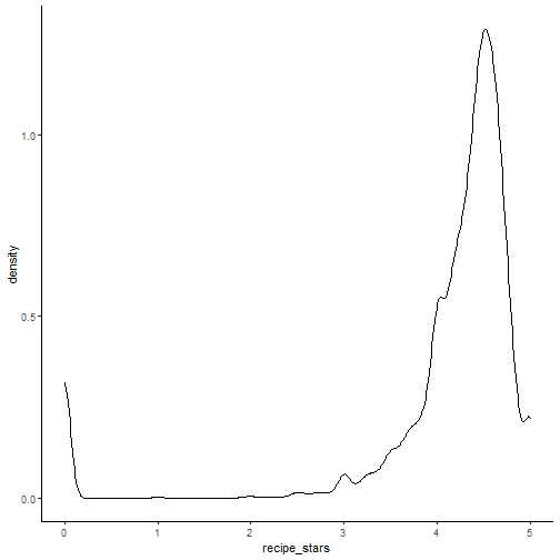
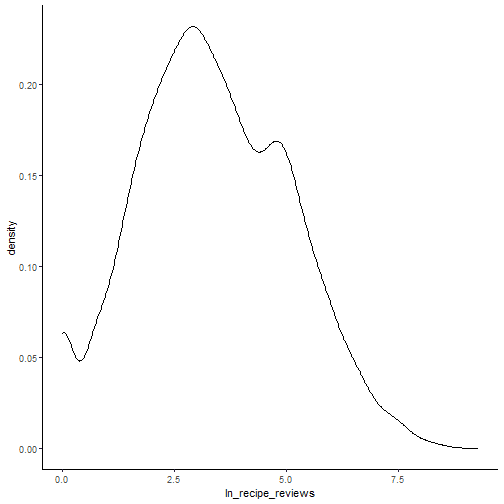
Not surprisingly, people who leave a rating tend to be on the generous side. The median recipe score is 4.4. There are also quite a significant fraction of recipes without any reviews. The distribution of reviews is closer to a pareto distribution or log-normal.
ggplot(recipe_df, aes(x=ln_recipe_reviews)) + geom_density() + theme_classic()
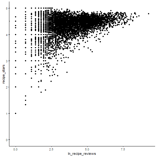
Do recipes with more reviews score better? Apparently so.1
ggplot(recipe_df, aes(y=recipe_stars, x=ln_recipe_reviews)) + geom_point() + theme_classic()
Text analysis
Now for the fun part - an analysis on the ingredients used. I will skip over the slightly tedious data cleaning procedures used to transform the recipe dataset to a coherent list of words associated with each geographical region / country.2
Let us take a look at the most common ingredient related words used across all recipes.
tidy_recipe %>%
  count(word, sort = TRUE) %>%
  filter(n > 1500) %>%
  mutate(word = reorder(word, n)) %>%
  ggplot(aes(word, n)) +
  geom_col() +
  xlab(NULL) +
  coord_flip() +
  theme_classic()
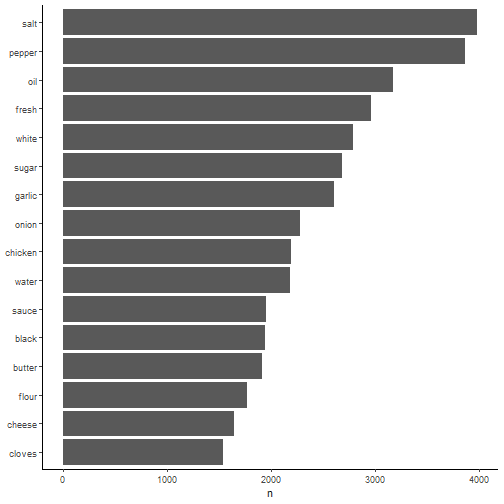
Salt and pepper comes up on top. White and black ranks highly too. These words are normally used to describe certain ingredients (e.g. white pepper, white flour).3 Next, we can compare the frequency of words used in recipes from two different countries.
frequency <- tidy_recipe %>%
             count(geog, word) %>%
             group_by(geog) %>%
             mutate(proportion = n / sum(n)) %>%
             select(-n) %>%
             ungroup() %>%
             dcast(word ~ geog)

ggplot(frequency, aes(x = France, y = China)) +
  geom_abline(color = "gray40", lty = 2) +
  geom_text(aes(label = word), check_overlap = TRUE, vjust = 1.5) +
  scale_x_log10(labels = percent_format()) +
  scale_y_log10(labels = percent_format()) +
  theme_classic() +
  theme(legend.position="none")
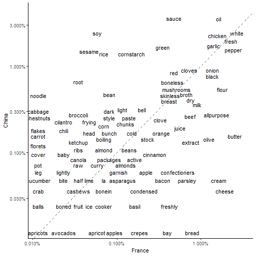
Observations at the top right are ingredients which are commonly used across both recipe groups while those at the bottom left are rarely used. The results are in line with my prior expectations - chinese recipes use rice, soy and sesame a lot more frequently, while french recipes tend to feature dairy ingredients more prominently.
To summarise the similarity between recipes from different regions, we can calculate the correlation between the frequency of words used across regions.
temp <- cbind(frequency$China, frequency$India, frequency$France, frequency$Italy, frequency$Japan)
colnames(temp) <- c("China", "India", "France", "Italy", "Japan")
cor_matrix <- cor(temp, use="pairwise.complete.obs")
stargazer(cor_matrix, type="html",
          title="Country correlation matrix")
| China | India | France | Italy | Japan | |
|---|---|---|---|---|---|
| China | 1 | 0.649 | 0.582 | 0.539 | 0.837 |
| India | 0.649 | 1 | 0.622 | 0.623 | 0.571 |
| France | 0.582 | 0.622 | 1 | 0.726 | 0.583 |
| Italy | 0.539 | 0.623 | 0.726 | 1 | 0.503 |
| Japan | 0.837 | 0.571 | 0.583 | 0.503 | 1 |
That is about it for an exploratory analysis of the recipe dataset. I plan on using it as a word corpus. By mapping product information to the relative frequency of words used, I would be able to construct a measure of product to country similarity and finally a country weighted expenditure basket.
Footnotes
Of course one cannot conclude the direction of causality. It could be the case that truly better recipes are rated more highly and also receive more reviews. One could also argue that more highly rated recipes receive more reviews or even recipes with more reviews tend to appear better attracting higher scores. ↩
Basically, this involves cleaning up the text field and removing words not related to ingredients such as cooking procedures and measurement terms. Subsequently, I tokenise the entire list of ingredients such that each word is an observation by itself. ↩
In my research I consider both single words and bi-grams (two words) to get better accuracy on matching. ↩