- Published on
Using Leaflet in R - Tutorial
- Authors
- Name
Here's a tutorial on using Leaflet in R. While the leaflet package supports many options, the documentation is not the clearest and I had to do a bit of googling to customise the plot to my liking. This walkthrough documents the key features of the package which I find useful in generating choropleth overlays. Compared to the simple tmap approach documented in the previous post, creating a visualisation using leaflet gives more control over the final outcome. I will be covering two different kinds of display options (highlight on mouse over and on-click) as well as the use of layers. The post is an aggregation of materials from the official Leaflet for R documentation page as well as a few other blogs.
Initialising
I will be using a Singapore dataset consisting of the change in religious beliefs from 2000 to 2015, documented in the previous post. The file religion_map belongs to the SpatialPolygonsDataFrame class (though leaflet is also compatible with other classes of data). I have also used the ms_simplify function from the rmapshaper package to simplify the shapefile for web-plotting purposes.
First, we will need to change the projection of the shape file so that it uses a latitude/longitude system.
proj4string(religion_map)
## Error in (function (classes, fdef, mtable) : unable to find an inherited method for function 'proj4string' for signature '"sf"'
religion_map <- spTransform(religion_map, CRS("+proj=longlat +datum=WGS84"))
## Error in (function (classes, fdef, mtable) : unable to find an inherited method for function 'spTransform' for signature '"sf", "CRS"'
proj4string(religion_map)
## Error in (function (classes, fdef, mtable) : unable to find an inherited method for function 'proj4string' for signature '"sf"'
Now we can initialise the leaflet file by choosing a basemap which the polygons would subsequently be projected onto. There are a variety of basemaps and a full range of choices can be seen in the following link.
rawleafletmap <- leaflet() %>%
  addProviderTiles("CartoDB.Positron",
                   options = tileOptions(minZoom=10, maxZoom=13))
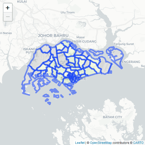
The addPolygons function overlay the base map with our desired shapefile. In order to fill the shapes with the desired colours, we need to pass a vector containing the colour hex codes to the fillColor argument of the function. The colorBin function simplifies this task. In this example, I use the "RdYlGn" palette from RColorBrewer which has a nice divergent scheme that suits the data that is going to be presented. To make it easy to follow through the steps, I shall plot the change in Christianity share from 2000 to 2015 (Christianity_diff) for all the subsequent examples.
bins <- c(-20, -10, -5, 0, 5, 10, 20)
pal <- colorBin("RdYlGn", domain = religion_map$Christianity_diff, bins = bins)
leafletmap <- rawleafletmap %>%
  addPolygons(data=religion_map,
              fillColor = ~pal(Christianity_diff))
# The ~ sign is used to signify that the variable used in the argument comes from the data
leafletmap

Highlight
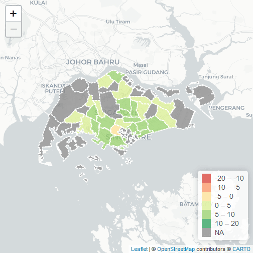
In the subsequent plot I edit some options to make the choropleth look better and add an interactive mouse-over function. The text that is going to be displayed has to be formatted as a html code. The line styles and display options are mainly adopted from the official example which incidentally looks much better than the default thick blue lines. A legend can be included using the addLegend function.
labels <- sprintf(
  "<strong>%s</strong><br/>Diff: %g ",
  religion_map$PLN_AREA_N, religion_map$Christianity_diff
) %>% lapply(htmltools::HTML)

leafletmap <- rawleafletmap %>%
  addPolygons(data=religion_map,
              fillColor = ~pal(Christianity_diff),
              weight = 2,
              opacity = 1,
              color = "white",
              dashArray = "3",
              fillOpacity = 0.7,
              highlight = highlightOptions(
                weight = 5,
                color = "#666",
                dashArray = "",
                fillOpacity = 0.7,
                bringToFront = TRUE),
              label = labels,
              labelOptions = labelOptions(
                style = list("font-weight" = "normal", padding = "3px 8px"),
                textsize = "15px",
                direction = "auto"))

leafletmap %>% addLegend(pal = pal, values = religion_map$Christianity_diff, opacity = 0.7,
                         title = NULL, position= "bottomright")

Popup
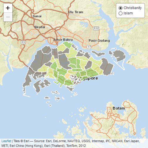
An alternative to the mouse over highlight function is to display the required information when a particular region is clicked. We can do this by passing the labels to the popup argument. I also selected another basemap, this time with colour, for additional variety.
leafletmap <- leaflet() %>%
  addProviderTiles("Esri.WorldStreetMap",
                   options = tileOptions(minZoom=10, maxZoom=13)) %>%
  addPolygons(data=religion_map,
              fillColor = ~pal(Christianity_diff),
              weight = 2,
              opacity = 1,
              color = "white",
              dashArray = "3",
              fillOpacity = 0.7,
              popup = labels)
leafletmap

Layers
Leaflet supports the plotting of multiple choropleth layers. This allows different information to be displayed depending on the choice of selection. To add layers, one simply assigns a particular group to an addPolygons code chunk and control the final output using the addLayersControl function. In the following example, I create an extra layer to visualise the change in Islam share over time.
labels2 <- sprintf(
  "<strong>%s</strong><br/>Diff: %g ",
  religion_map$PLN_AREA_N, religion_map$Islam_diff
) %>% lapply(htmltools::HTML)

leafletmap <- leaflet() %>%
  addProviderTiles("Esri.WorldStreetMap",
                   options = tileOptions(minZoom=10, maxZoom=13)) %>%
  addPolygons(data=religion_map,
              fillColor = ~pal(Christianity_diff),
              weight = 2,
              opacity = 1,
              color = "white",
              dashArray = "3",
              fillOpacity = 0.7,
              popup = labels,
              group = "Christianity") %>%
  addPolygons(data=religion_map,
              fillColor = ~pal(Islam_diff),
              weight = 2,
              opacity = 1,
              color = "white",
              dashArray = "3",
              fillOpacity = 0.7,
              popup = labels2,
              group = "Islam")

leafletmap %>% addLayersControl(c("Christianity", "Islam"),
   options = layersControlOptions(collapsed = FALSE))

Multiple layers
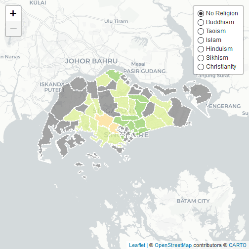
The code is already getting quite long due to the repetition of colour and line options. What if we want to create multiple layers and minimise the clutter? One way to do that is to write a small wrapper function that repeats the addPolygons tasks. The LeafletLayer function in the code below is used to create the final plot which shows the change in the proportion of residents subscribing to a particular religion for 7 different groups. The function could probably be more generalised and accept other use inputs but it suits my needs perfectly fine.
group <- c(names(religion_map)[40:45], "Christianity_diff")
labels <- vector("list", length(group))
fill <- vector("list", length(group))
for (i in 1:length(group)){
  fill[[i]] = pal(religion_map@data[,group[i]])
  labels[[i]] <- sprintf(
    "<strong>%s</strong><br/>Diff: %g ",
    religion_map$PLN_AREA_N, religion_map@data[,group[i]]
  ) %>% lapply(htmltools::HTML)
}
## Error in pal(religion_map@data[, group[i]]): trying to get slot "data" from an object (class "sf") that is not an S4 object
#' A wrapper for addPolygons function.
#' @param map raw leaflet basemap.
#' @param data dataset containing all the variables to be plotted
#' @param fillColor list of colours for each group
#' @param labels list of labels for each group
#' @param group vector of group names
#' @return leaflet file with the added polygon layers
LeafletLayer <- function(map, data, fillColor, labels, group){
  for (i in 1:length(group)){
  map <- addPolygons(map = map,
      data=data,
      fillColor = fill[[i]],
      weight = 2,
      opacity = 1,
      color = "white",
      dashArray = "3",
      fillOpacity = 0.7,
      group = group[i],
      highlight = highlightOptions(
        weight = 5,
        color = "#666",
        dashArray = "",
        fillOpacity = 0.7,
        bringToFront = TRUE),
      label = labels[[i]],
      labelOptions = labelOptions(
        style = list("font-weight" = "normal", padding = "3px 8px"),
          textsize = "15px",
          direction = "auto"))
  }
  map <- addLayersControl(map=map, baseGroups = group,
                          options = layersControlOptions(collapsed = FALSE))
}

map <- LeafletLayer(map=rawleafletmap, data=religion_map, fillColor=fill, labels=labels, group=gsub("_diff", "", group))
map

Hope you find this tutorial helpful and useful. It is actually quite simple to create interactive maps in R and maybe this will also inspire you to work on your own visualisation projects.